Designing the Pickup Experience in the United States
Conversion Flow
Food Tech
Interaction Design
The end experience
Setting the Context
Fast-casual dining in the U.S. has shifted toward "order ahead" pickup - users place orders on apps like Uber Eats or DoorDash and arrive just in time to collect their food.
Goal
Design a pickup-first food ordering experience for the U.S. market.
Timeline
24 Hours - Mar 2026
Decisions that Shaped the Experience
The habit of customization
Long, uniform restaurant lists feel repetitive and make users less likely to explore.


Impact
Reduces time to place an order
Minimizes friction for repeat users
Enables a faster path to checkout
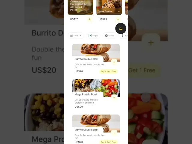
Encouraging Exploration
Long, uniform restaurant lists feel repetitive and make users less likely to explore.


Mixed horizontal and vertical layouts to add variety and make browsing more engaging.
Extra negative space used to encourage exploration
Impact
Reduces visual fatigue during scrolling
Encourages users to explore more restaurants
Improves overall browsing experience
Navigation Is Personal
People use different map platforms to navigate their way in the United States

While in-app maps which are available on platforms like UberEats and DoorDash are convenient, many users prefer their own navigation app because of familiarity, saved locations, and real-time traffic.

The “See on Map” gives the users the flexibility to choose their preferred map app to navigate to the pickup place
Impact
Gives users flexibility and control
Reduces friction in navigation
Creates a more seamless pickup experience
Indicating Progress
Moving straight from checkout to tracking can feel abrupt. Users need reassurance that their order has been placed before they start tracking it.

I introduced a confirmation screen before the tracking page and started the progress bar with "Order Confirmed" already completed.

This creates a clear starting point and makes the journey feel continuous.

Impact
Creates a stronger sense of progress and continuity
Makes the tracking experience feel more structured
Reduces uncertainty about order status
Every Pickup Is Different
Pickup methods vary from restaurant to restaurant. Some use pickup shelves, others hand orders over the counter or through a drive-through. Without clear instructions, users may be unsure where to collect their order.

Adding clear pickup instructions to the tracking screen, helps users know where and how to collect their order.
Impact
Reduces confusion at the restaurant
Speeds up order collection
Creates a smoother pickup experience
